A Web Interface for the NHTSA Evidence System
The evidence system I wrote about last time lived in a Fabric notebook: you set a question code and some parameters, ran a cell, and read the answer out of a table. That’s fine for me. It’s not something you’d hand to anyone else. So I put a thin web front-end on it.
The interesting part wasn’t making it look nice. It was that a UI is exactly where a system like this usually starts lying — smoothing a ranked pile of unverified complaints and one official investigation into a single confident paragraph. I’d spent the whole backend keeping those things apart. I didn’t want the interface to merge them back together.
Eight validated questions replace a free-form prompt
There’s no prompt to type into. You pick one of the eight validated questions — the same four routes from the engine, labelled right there — and fill in parameters.
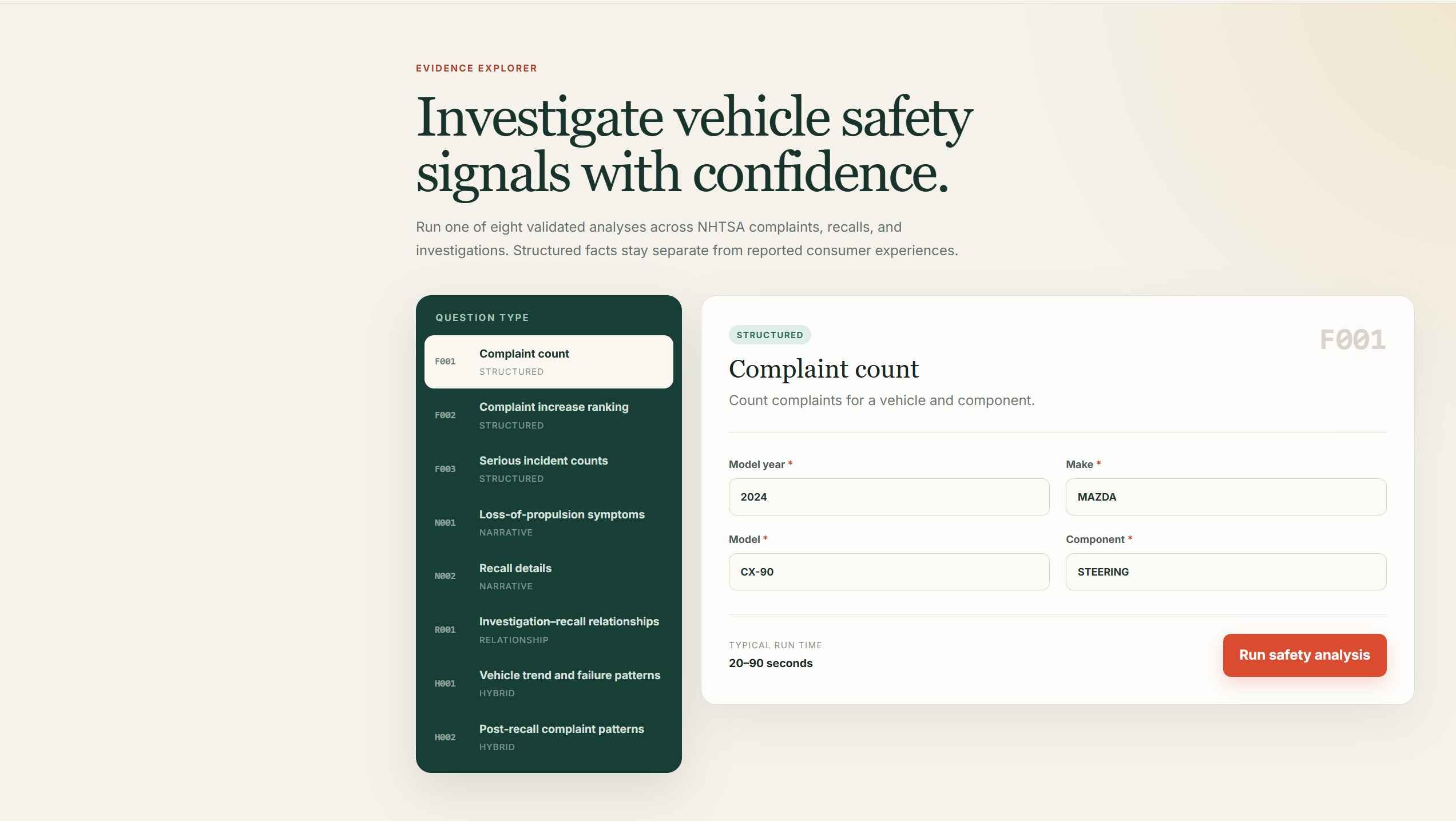
The interface is the routing table from the last post, made clickable.
The refusal to be a chatbot stops being a design opinion and becomes the literal shape of the screen: you can’t ask it anything it can’t answer with evidence, because there’s nowhere to ask.
Official records and consumer reports stay separate
The answer comes back as deterministic cards first — candidate population, complaint trend, the open investigation number — then a monthly trend line. Below that, the evidence splits in two.
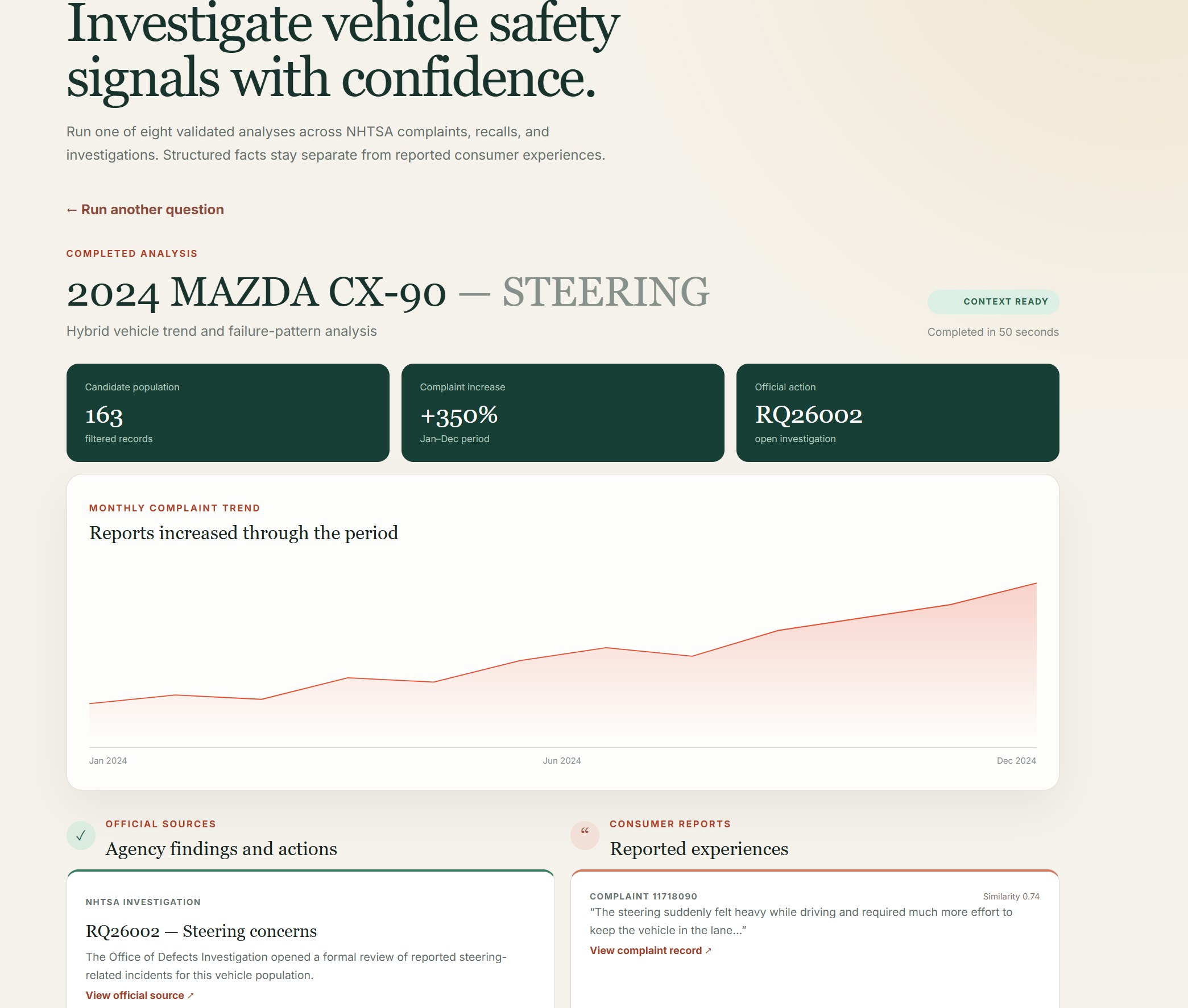
The is_official_source flag that lived in the schema is now a wall you can see: Official Sources on one side, Consumer Reports on the other, different colours, different icons, never interleaved. A chatbot would have to work to keep a recall and a complaint distinct in one flowing answer. This layout can’t blur them even if it wanted to.
Approximate matches display their scores
This is the part I care about most. Every consumer complaint shows its cosine similarity, and they’re ranked by it — 0.759, 0.755, 0.748, 0.745, descending. The official investigation sits in the other column with no score at all, because it wasn’t retrieved approximately. It was looked up by identifier.
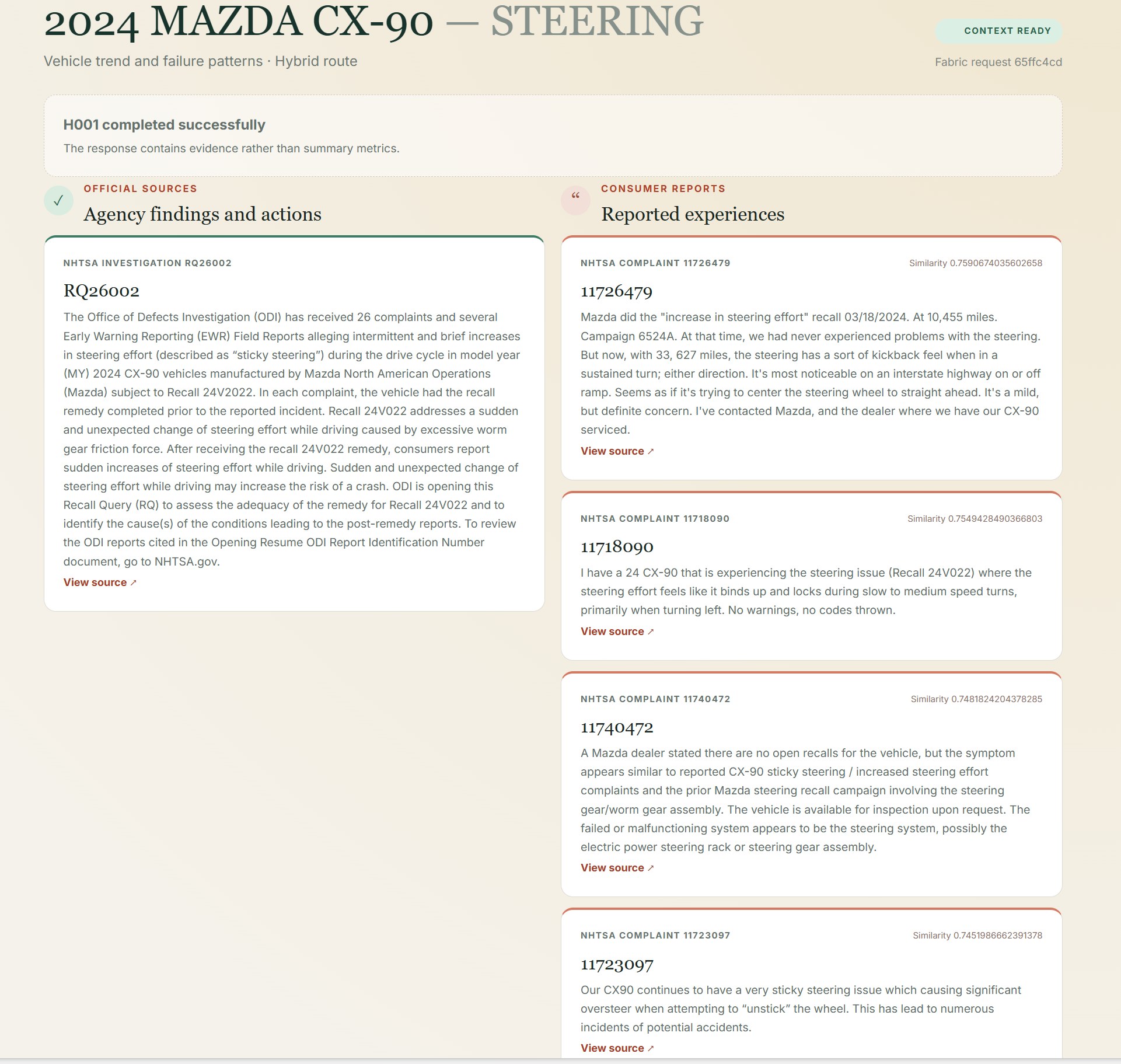
That empty space where a similarity score would go is doing real work. It’s the difference between this passage matched your question and this is the official record — and the UI shows it rather than papering over it. Every card, on both sides, links back to the NHTSA record it came from. The last post’s title holds up: every answer still cites its source. And a standing line at the bottom repeats what the data model already enforced — consumer complaints are unverified reports, not established findings of a defect.
The interface did not change the engine
Underneath, nothing was rearchitected. The page doesn’t call Spark; it drops a request into a queue and waits for the notebook engine to mark it CONTEXT READY, the same dumb-runner discipline as before. A hybrid question still takes about fifty seconds. This isn’t a production app — it’s the same engine with a face.
But the face is where honesty is easiest to lose, and it’s worth being deliberate there. The whole reason to build this carefully was to keep a report from being dressed as a finding. It would have been a shame to give it an interface that put the costume back on — the evidence-versus-authority line, undone by a layout. So the front-end shows its sources, prints its scores, and keeps the two kinds of evidence in two columns. It says what it knows, and how it knows it, and no more.
More on AI-native systems Every Answer Cites Its Source →